GLOBAL FUSION!! Taking inspiration from the tiles of Lisbon

Whilst walking the hilly streets of Lisbon I was captured by the tiled buildings I was surrounded by, compelled to take numerous photos of the ceramic-shelled architecture!  I’m not entirely sure why!

DSC03130 - Copy (2) - Copy

Having done a small amount of research I found that the art of the ceramic tile in Lisbon is known as ‘Azulejos’, an Arabic word meaning ‘polished stone’.  These tiles are used to decorate everything, from walls of churches and monasteries to houses, subways and park benches.  They came about in the Gothic period where there appeared to be a need to decorate large expanses of white plaster.  In Italy they used frescos, in Portugal there were tiles!  As well as serving a decorative purpose they also served a functional purpose in temperature control.  To begin with the tiles were imported from Seville and in accordance with Islamic law were not allowed to incorporate human forms and so consisted of geometric patterns- this could be the reason why I was so taken by them- my geeky mathematic mind has always been drawn to geometric images!  Later on the Portugese started to produce their own and began incorporating human figures and animals.DSC03195 - Copy

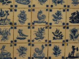
The dominant colours in the tiles are green, blue, yellow and white.  Although these tiles can be found in other European cities it is quite apparent that in Lisbon the Azulejos take on an expressive poetic form lacking in others.

Having been captured by these tiles I was very excited to find that B&Q stock tile effect wallpaper at just £10 a roll and Topps tiles sell ‘Lisbon effect’ tiles at £40-£70 per square meter.

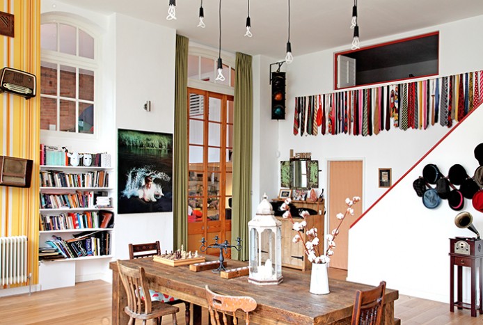
I love the idea of being able to incorporate elements of my travel into my interior design and retro furniture collection from around Europe.  With high street shops now stocking these ranges and restored furniture from around Europe readily available this can be done easily and cost effectively.

P.S. Lisbon is an amazing city to visit!

DSC03128 - Copy (2) - Copy

With the historic buildings and trams interspersed with grittier more bohemian areas reminiscent of East Berlin and the best custard tarts you will ever eat Lisbon is a city you could visit again and again and always find new corners and experiences.  Having been to numerous European cities there have not been any others that I have felt a need to return to!


Trends for 2016: Bringing the Outside In.


There are a number of different trends highlighted for 2016.  Top of the list is ‘bringing the outside in’.  This involves furniture that can be used both inside and out, incorporating greenery indoors in the form of wall décor or accessories and the addition of plant life.  I’ve created a Pinterest board of my favourite examples!

I thought I would look into wall décor – so, I spent a long time doing one of my favourite activities in the whole world- trawling through hundreds of books of wallpaper!  I love wallpaper!

Here are some I found that would be great for bringing the outside in:

20151203_122847
Matthew Williamson at Osborne and Little: Sunbird Colour Metallic purple/Electric Blue/Green W6543-01


20151203_123159
Osborne and Little: Tulipan W6753-02


Reasons to love art deco

Art deco was an art movement that began in France and gained popularity in the 20s after the first world war when people had begun to relax and remained so until around the start of the second world war.

The style consists of geometric and angular shapes, chrome, mirrors and other shiny finishes.  Designs often contained stylised images of cars, cruise ships, skyscrapers and planes or nature motifs such as shells, flowers and sunrises.  It is also characterised by highly contrasting materials such as highly polished wood against glossy black lacquers with satins and furs.

I love art deco.  For me it conjures images of glamour- sleek dresses embellished with jewels and beads, large feather head dresses.  The furniture was in in my mind still is the ultimate in style-glossy woods, large oversized geometric shaped mirrors, sleek curves, luxurious leather and exotic embellishments.

The art deco cocktail chairs and armchairs are my favourites!  So sleek and glamorous.  See some pic here on Pinterest.  If I smoked and could handle cocktails I could just picture myself with a porn star martini and a long cigarette holder reclining in one of these!  Have a look on ebay………

I have always had a soft spot for the architecture.  The run down blocks of 1920s flats I see dotted around Leigh-on-Sea and the parades of shops that are almost invisible hidden within the more modern buildings surrounding them really capture my imagination.  I love the curved bay windows, the sunburst motif stain glass windows.  The Chrysler building of course is also pretty cool!  For more amazing images have a look at my Pinterest board.

I love what the art deco movement represented- the time where people felt they could breath again after the first world war and before the depression began.  When women’s liberation began and the economy was prosperous, technology was growing and modern life consisted of luxury and leisure.

1510415_10151848262196641_1917296961_n1506925_10151848262201641_1215145131_n1525764_10151848262631641_938153444_n1503831_10151848262641641_803023037_n

Ocean Drive for me is one of the best places ever!  The whole stretch of vibrant colourful geometric buildings.  With the lively bars, trendy hotels and shops all over looking Miami’s South Beach.  I don’t think there is anywhere better!  And of you ever visit try a mojito in Mangoes…….


5 Tips for Mixing Modern and Retro Furniture

For a long time I believed that all furniture in one room had to be made from the same wood and be from the same furniture range.  I have more recently become aware that this is not true!  There are no rules that state this and incorporating contrasting styles of furniture and accessories into a room adds texture and can bring a room to life.  My house is definitely a mixture of styles and none of it was entirely planned or possibly to anyone’s other than my taste but I’m quite happy with it!  Using a mixture of styles also makes it easier for a room to evolve as trends and your tastes change- bits can be added or removed without having to start from scratch or redecorate.

There are rules that need to be followed when attempting to combine modern and vintage or retro style furniture otherwise you’ll end up with a crazy, headache inducing eclectic hotch potch of a room!

Number one is to go for a neutral backdrop- greys, creams or whites then add interest with your furnishings.  This will also ensure any statement pieces will really stand out and will not be lost within the room.

So number two is the 80:20 rule.  As long as you stick to a modern style for 80% of your furnishings the other 20% can be made up with either vintage or retro.  Maybe try pairing a modern contemporary table with some retro style chairs?  Or vice versa a retro desk with a modern contemporary chair?

PrivateResidenceASweets13-e1433418587319
I love this dining area- from designer Avocado Sweets. A really lovely example of how vintage can be in harmony with modern. (Photo credit Fisher Hart).

Click here to see more photos of the above apartment and other designs by Avocado Sweets!

Number three- make sure that the 20% vintage/retro items are evenly distributed throughout the room.  One random piece of French vintage furniture may look a bit odd amongst its modern counterparts however dotting some French vintage style accessories such as a lamp or jug on these modern pieces will help!

Number four- don’t mix ornate styles such as Chinese or baroque with simple styles such as arts and crafts or Danish retro.  They do not mix well!

And finally number five- make sure every piece of furniture and accessory is beautiful in it’s own right.

I read somewhere that a successful space should be made up of smaller vignettes, meaning that if you took photos of random areas of a room each one should be an exquisite snap shot.

For inspiration visit my board on Pinterest specifically made for the mixing of retro/vintage and modern furniture.

The Adventures of Kplan Kate: The tale of the Art Deco French Leather Armchair

The tale of the brown leather chair begins in France I guess around 1930 when the art deco style was flourishing.  Where he resided until May 2015 is sketchy.  But what is known is that he made it into the back of a French market traders van and was transported to Les Puces de Montreuil in Paris.  He hadn’t even made it onto the market.  The poor sad chair was hidden under a mountain of clothes and accessories still on the back of the van.  Luckily his beautiful elegantly curved legs were just visible and after seeking out his owner a deal was struck and the next part of his story begins.

He was once again loaded into the back of a van however this time he met lots of other furniture friends and was no longer hidden away under garments and bags.  He departed France destined for a new home in England.  He arrived there looking sad with torn plastic fake leather upholstery.

june2015 014

He was stripped of all his ripped plastic faux leather, then reupholstered in eco leather a recycled leather in keeping ethically with the idea of rescuing old furniture pieces.

He now looks handsome and elegant and is awaiting a new owner at www.kplan.furniture.  If you think you can offer him a loving new home take a look!

art deco chair 3

art deco chair

art deco chair 2

The Adventures of KPlan Kate in Paris: Lobsters, Retro Furniture and Battlesbridge on Crystal Meth

I have just returned from our adventures in Paris and am absolutely shattered- if only from driving a massive van clearly not designed for girls!

The van we took this time was massive- we needed a crew van because Steve joined us on our expedition and a transit only has two passenger seats.  If I was worried about driving the transit-that was nothing compared to this beast!  I hired it from a company called lobster van hire!

pairs may 2015 024
Who knows what kind of trouble we’d have been in without this sign on the van!
pairs may 2015 178
Our Parisian Home!

The van was ok to drive but being a girl with small feet I found it incredibly uncomfortable to drive because I couldn’t rest my heel on the floor with my foot on the clutch, which really does your calves in!  I will take this into consideration when I come to buying my own van!  We got to Paris about 11pm and by the time we had met the guy who was to let us into our Parisian apartment for the next 4 nights (I decided this would be a better option with the girls and financially so we wouldn’t have to eat out every night- check out airbnb.com- you can rent peoples apartments/houses while they’re away and live like you actually come from that city!  Steve’s neice put me onto it and I was really impressed!) it was about 11.30pm.  I then sent Steve out on a wine run while I unpacked and put the girls to bed with lovely clean teeth.  About 15minutes later Steve bounds back in really chuffed with himself armed with McDonalds- I was really pleased when he went and got the girls back up again to eat Big Macs!  Very little sleep was achieved that night and I got us all up again the next morning at 6.30am to attack the first flea market on my list!

We checked out a market called ‘Marche aux Puces (French for flea market) de la Porte de Vanves. pairs may 2015 012 This market is south of the Seine.  I let Steve do the driving (mainly because I was too scared to try to park the van!)- I have never seen anything like the roundabouts in Paris.  They are huge and have a million different exits off them and no distinct lanes!  They are a massive free-for-all.  If you’ve got a weak heart I would definitely recommend never driving in Paris!  So pairs may 2015 014arriving there in one piece (and not having to pay to park because all parking is free in Paris on weekends it appears) we began to wander.  Shortly into our wander Steve pointed out there wasn’t a lot of furniture and I began to worry.  I had also written a little note next to this particular market on the market list  had pre-prepared ‘?not good for furniture’ so it wasn’t boding well.   Also any furniture I had seen and liked was crazily over priced.  Anyway the further we delved the better things were- the market wasn’t huge (compared to the flea market in Tongeren, Belgium- you can read about it here) but spanned over a couple of streets and we found quite a few retro chairs and a desk  plus a nice antique style oak wardrobe.  I think overall this market was my second favourite of the trip.  Although it’s not huge the content was pretty good, the atmosphere was good and you can find yourself some bargains if you delve deep enough.  There were also some really weird and wonderful treasures to be found!

pairs may 2015 025pairs may 2015 019   pairs may 2015 020 pairs may 2015 013 pairs may 2015 014

pairs may 2015 102
These things caught my eye-I can vaguely remember them from my childhood-pretty sure my brother had one-any idea what they were called???

On day two we were en route to Marche aux Puces de St Ouen when we stumbled across a market in Vincennes.  I did a bit of research to try to find out what the market was called but l’m pretty sure if was a market on purely for the bank holiday weekend.  I think there is a market in Vincennes but it’s more foody and is on a Saturday and Wednesday.  The one we stumbled across was really good.  I bought a couple of retro leather chairs and by now was getting a lot more confident in the bartering and getting to grips with French numbers.  I was fairly impressed with how much GCSE French I remembered.  I have Mrs Howes to thank for that!

pairs may 2015 166
The tree lined market at Porte de Vincennes

pairs may 2015 169 pairs may 2015 168

After we’d exhausted that market-or rather the market had exhausted the girls we headed on to the Marche aux Puces De St Ouen.  And I have never seen anything like it.  It was HUGE!  It was described online as Europe’s biggest flea market.  I am not surprised-apparently there are 15 markets all in one. Each area of the market appeared to be very different.  The first part we arrived was called Paul Bert and Steve described it as ‘Battlesbridge on meth’.  Anyone who ever visited Battlesbridge Antique centre in Essex will know that it is basically people selling lots of over priced junk!  This place was like that except the junk was more extravagant and more outrageously priced.  Worth a look though!

pairs may 2015 107
The Paul Bert Market area

pairs may 2015 109 pairs may 2015 108

On leaving that area we stopped for moules and frites.  And the customer service was nothing I’ve never seen before!  An American guy seated behind us complained that all his mussels were empty shells.  The owner came out to speak to him and said that the mussels might be at the bottom of the bowl.  The customer said that ‘no, they weren’t’ and so the owner took his bowl away and said ‘ok, goodbye’!

pairs may 2015 110pairs may 2015 112

The next area we went in was a slightly dulled down version of this and then we entered an area which was a little bit grubby and I think there may have been a few opportunist stall holders who had thrown down a bit of cloth and any old bits of rubbish they’d managed to put their hands to!  Then we moved onto an area which had loads of stalls selling tracksuits and trainers!  I’m sure had we have stayed and explored more we may have found some decent areas but I was feeling uncomfortable in the area we were in and the girls had certainly had enough.  The reviews I’d read about this market weren’t great and I have to say I wasn’t keen!

pairs may 2015 118 pairs may 2015 117 pairs may 2015 116 pairs may 2015 115

Our final market trip on the Monday was Les Puces de Montreuil.  This was more of a market than a flea market.  The first area we walked through was all ram shackle market stalls with all sorts of junk-it was quite unsavoury!  Then we headed down the road and found a beautiful chair.  This however was the only stall selling furniture and this chair was the only nice piece!  Moving further into the market it became apparent I was not going to find any thing of interest.  There were mainy stalls selling new but cheap and nasty clothes.  One little gem though- I found a stall selling upholstery material at a price so good I still can’t work out how the stall holder makes any sort of profit!

pairs may 2015 164 pairs may 2015 165

I’m sure there are many other flea markets in Paris but if I had to recommend one to go to if you like that sort of thing I would have to say the market in Vincennes was my favourite but since it’s not there all the time check out Marche aux Puces de la Porte de Vanves.

Oh, and we did manage to squeeze in a bit of site seeing!

pairs may 2015 186

The Adventures of KPlan Kate: The of fruits of Belgium, before and after

So now it’s time to reveal a few before and after pictures from the fruits of our Belgium adventure…………….

The handsome black Louis XVI chair

Before……………….

girls birthday and furniture feb 2015 016

And after……………

KPlan shoot-22705-Edit

The Stylish sophisticated, now lime and grey Louis XVI chairs (see my previous blog to read about some of the work put into the chairs https://wordpress.com/post/84763468/107/ )

Before………………

chairs march 2015 005 chairs march 2015 015 chairs march 2015 002

After……………

KPlan shoot-22708-Edit

KPlan shoot-22714

The beautiful oak table

Before covered in water marks and with splintery legs……………..

chair april2015 009

Now with a beautiful wax oil finish……………

KPlan shoot-22742 KPlan shoot-22724

The retro grey chairs-now with stags!

Before-looking tired and dull………………..

chairs, french polish, ideal home march 15 002

After………………………

KPlan shoot-22702-Edit

And finally, the chairs I won at the auctions…………….

chairs march 2015 030

After……………………..

KPlan shoot-22710-Edit

Now that I’ve finished the Belgium articles, I am heading off to Paris tomorrow with my girls and Steve to see what other treasures we can find!  Watch this space!!!

P.S. I’m really pleased with the professional photos I had done of the furniture for my website-can you spot which ones are the pro’s and which are mine??!!

The Adventures of K Plan Kate: Fustration, despair and logo design headaches

Arrgggghhhh!  Who would have thought that trying to create a logo would be soooooooo hard?!

So, originally I thought what I wanted was a really plain design-basically K Plan Furniture in a fancy font.  Below was the logo mark one.  I thought the K looked more like an X-but on closer inspection you can see that the K is actually  a chair.

I’m not a fan of the orange and brown colour scheme.  They had gone for neutral colours and the orange is apparently ‘warm yellow’ but these colours are too reminiscent of my school uniform for me to appreciate them.

I’d got in mind something in black and white.  The ‘furniture’ bit I liked, but in my head the ‘K’ would be a lot bolder.  So here comes mark 2.

20150320_193322

This was exactly what I asked for and thought I wanted but seeing it on the computer screen it turned out it wasn’t what I wanted!  What I really want is something fairly simple-I’ve been studying logos everywhere I go for the last few weeks and all the big brands are really just the brand name written on it’s own, for example ‘Waitrose’ and ‘Samsung’.   But I also want something that reflects me a little bit.  I want it to be fairly classy and not be something that will look dated in no time at all.

Steve and I were discussing it the other night via facetime and he thought a picture of a lady pulling a chair behind her in silhouette form might look quite good-he leaned his phone up against something and was posing for me with chairs being dragged behind him to demonstrate!

I emailed the company working on my website and logo with this idea and had visions of him opening it and going ‘oh, ffs’!  Unfortunately these big ideas were not quoted for, so I’ve got my Dad on board to help brainstorm!

These are the first batch from my Dad- I really like them but I feel like they’re still not quite right.

logos

Then these are the second batch because I thought a chair should be in it:

more logos

I really like D and think it would look really good on a business card but I wonder whether it’s a bit too fancy to go at the top of the website and any headed paper?!

The more I try to come up with something the more fed up and cross I’m getting with the whole thing.  I decided to check in with Pinterest to see what kind of logo inspiration they could provide me with.  There are some really clever ones out there………….

4e609853e16077f8f251a4d5badfe921

This is my particular favourite- the company is F3.  Can’t remember what the company does though!

ec5bad4a096e7001ef3b26dcd1dcde10 (2)

I liked this idea-to use my own handwriting for the ‘k’.  I spent a bit of time doodling and trying different ways of joining up the K, P and F.  I liked them on paper but when I scanned them for some reason I didn’t like them on the screen.   Not sure what happened to them but they just looked really rubbish!

My most recent effort is a geometric style ‘K’ in a box.  I drew it on the computer in paint- I did the K then wrote ‘plan’ in a really nice square type font, then went to type ‘furniture’ but couldn’t find the same font again.  I tried EVERY single font on the stupid computer programme and never found it.  It had completely disappeared!  So, I have no idea whether it will look any good with the ‘furniture’ added.  I have emailed to the guys at the website company and am waiting to see what it looks like all tidied up and with ‘furniture’.  Fingers crossed it looks decent because I am losing the will to live!

I would really appreciate any comments or ideas???!!!!!   Pleeeease!!!!!!!

The New Adventures of KPlan Kate: Louis Chairs, Stab Wounds and Gel Nails

Since my blog is about KPlan Kate and her furniture I thought I should really write one about some furniture!

In Belgium I purchased three French Louis style chairs.  Now there are four different styles of Louis chair.  I will tell you all about them!

So, there were four King Louis’ of France and the furniture at each of their different times of reign had a different style.  Fashions in those days developed based on what the King liked, so the style of furniture the King of the moment liked became fashionable and so the style was named after him.  King Louis XIII reined from 1610 to 1643 during the late renaissance period.  The chairs from this era have straight backs, turned legs and more often than not, curved arms.  At the bottom of the chair, between the legs they have ‘H’ shaped stretchers to hold them together.  They looked quite like this:

scan 13th

King Louis XIV reigned from 1643 to 1715 during the Baroque period.  These chairs tended to be much larger providing more space for the large puffy dresses worn by the ladies at that time!  He also built himself a huge Chateau with huge rooms and so needed large bits of furniture to fill them! The backs didn’t tend to be attached to the seat of the chairs as they were previously and the arms and legs were very intricately carved and sometimes gilded with bronze or silver.

scan 14th

Then came Louis XV from 1715 to 1774.  The Louis XV style was Rococo.  The big difference here was that the chairs have a cabriole leg-kind of like an ‘S’ scroll shape.  Again the chair evolved to fit the fashion of the time with shorter arms to accommodate the large hoops in the women’s dresses.   The chairs at this time were quite feminine with curves and fancy carved motifs and gilding.  They looked like this:

scan 15th

The final Louis was Louis XVI and the style was neoclassical.  The biggest clue as to whether you have a Louis XVI chair is again in the leg.  They always have tapered straight legs.  They were trying to recreate the patterns of the ancient Greeks and Romans in these chairs, so they are carved with laurel leaf wreaths and fluted columns.

scan 16th

Having looked at hundreds of pictures of Louis style chairs there seem to be a lot of overlaps in the various styles but the biggest clue is always the legs.  The three chairs I picked up in Belgium all have straight tapered with laurel leaves carved into the arms.  They also have column patterns around the seat.

So, I set about restoring the chair I thought would be easiest.  The upholstery was in really good condition.  It is black velvet.  The frame, however was less desirable.  It was really chipped and parts had completely crumbled away.

girls birthday and furniture feb 2015 019girls birthday and furniture feb 2015 018

I set about filling these crumbled bits with some wood filler and a teaspoon!  I always find myself using cutlery for this kind of thing despite possessing a complete plethora of tools.

girls birthday and furniture feb 2015 021

After waiting for the filler to dry I sanded it with some really fine sandpaper, then gave the whole frame a lick of black gloss paint, added some new little pads on the bottom of the legs and the chair looks like new!

chairs march 2015 042

The other two chairs are currently causing me a lot of grief.  They need reupholstering and the frames need stripping and re-finishing.  Before I could even start on all this I’ve had to remove close to a million pins and staples just to remove the old material.  I’ve endured stab wounds from the steak knife I’ve been using along with the more conventional tack remover and nausea from the paint stripper fumes!  As soon as I have finished I will write a blog all about it!

chairs march 2015 029
On the plus side-my gel nails withstood the paint stripper!!